Let’s DEW It
VISUAL BRANDING
A RE-branding of sorts, Let’s DEW It is the reinvigoration of a single line of products from a previous company. The client wanted to retain the elegance of her earlier brand, but bring in an element of approachability and playfulness as well, all within a tight deadline.
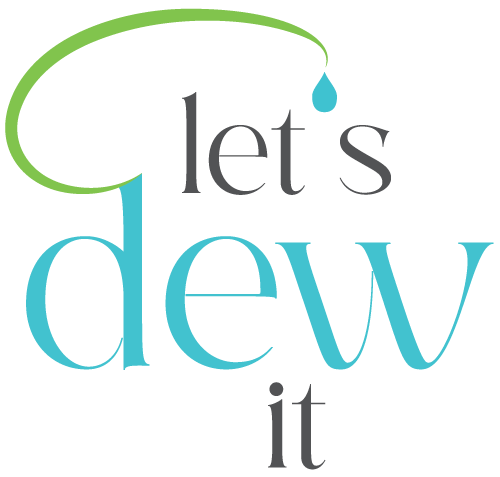
While the name of the company was to take a relative back seat, each product name would be a play on “DEW”, to reflect the moisturizing nature of the products. This overall concept was integrated into the logo which incorporates a leaf shape and dewdrop.

This simple iconography is able to communicate the nature of the product, unify the text and bring in a playfulness with bright colors and having the dewdrop substitute the apostrophe in the company name. The element in repeated in the product names, with the dewdrop taking a more active role in “moisturizing” the descriptor word.
Balancing out the playfulness is an elegance, maintained with a delicate serif font with soft curves, once again alluding the product itself and product results. This elegant playfulness speaks directly to the target audience, women ages 40 & up who are confident and capable, and who value quality.

LABELS
Following thru with the elegance factor, a matte black label was chosen for the protective violet miron bottles, letting the product name be the highlight. Monochromatic monstera leaves add subtle tropical tones without overcomplicating the label.
Additional dewdrop iconography was created to support the brand, which appears both on the business cards and labels.
STYLE GUIDE
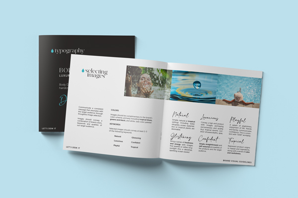
Finally, brand visual guildelines were created to support the client moving forward in her journey. With mood boards, image selection & logo usage guidelines, and color and typography identification, future development of her website and marketing assets can easily be consistent and maintain her brand image.

I'd love to hear about your project.
Drop me an email!
