Essence Organique
LABELS
The client and I met in the early days of both businesses and went on a discovery journey together. Where we ended up truly reflects the expertise behind this bath and body care line, as well as representing the simple and carefully curated ingredients within the products.
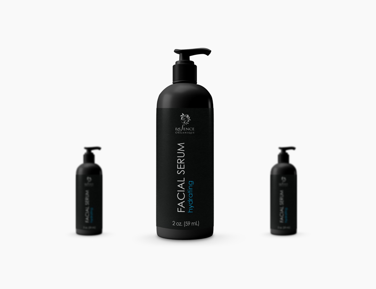
With a clientele of discerning taste, the “black label” approach conveys the luxuriousness and exclusivity of the product, while allowing the color of the product to stand out.
A modern sans serif font highlights the simplicity of the products within and a splash of color readily distinguishes the different scents and product “flavors”.

SPECIALTY LABELS
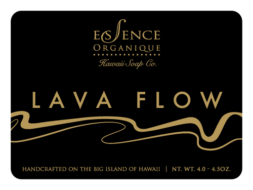
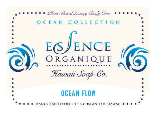
Along the way, special products and limited releases were requested by local businesses and events, requiring unique labels. Each occasion and intended consumer was carefully considered in each new design.
LOGO REFINEMENT
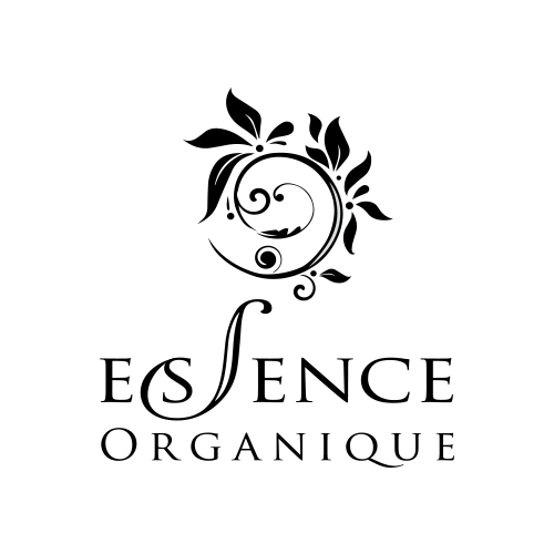
Along the way, EO’s logo was refined as label development organically progressed. Retaining the text, the original background scroll element was first integrated into the design, and then unified with the logo as the logo icon, reflecting the Golden Ratio spiral, or the sacred geometry found in nature, and in the product line.

MUCH MORE
The owner and I worked on many more projects together, including multiple websites, a wide array marketing collateral, and additional product requirements that arised. It was truly inspiring to see her line grow, and I am proud to have gained a friend in the process.
I'd love to hear about your project.
Drop me an email!


